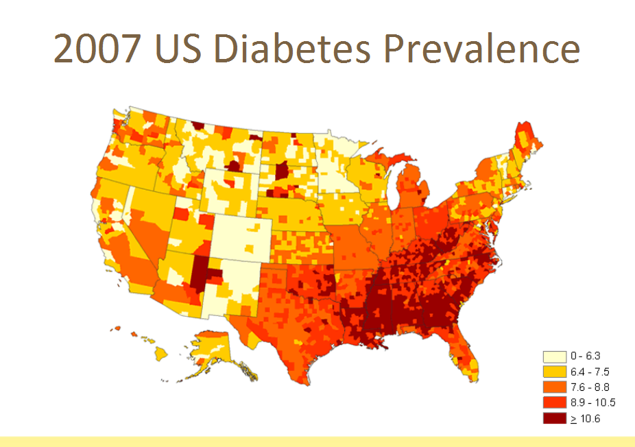
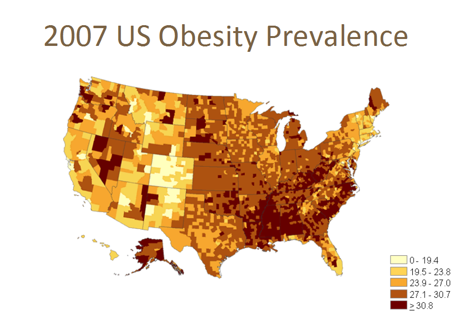
If you ever wondered about how connected obesity, physical inactivity, and diabetes truly are, then let this very powerful data speak to you.
Below are three maps of the United States (from CDC). The colors depict the prevalence of (i.e. the percentage of the population that has a diagnosis) Obesity (Map 1), Physical Inactivity (Map 2), and Diabetes (Map 3). This is 2007 data which means that, unfortunately, the picture today (6 years later) is worse than this.
It is remarkable how these maps can virtually be superimposed, one atop the another.
Map 1
Map 2
Map 3

It would appear that Fast Food is very much a part of this problem. Amazingly, the distribution density of McDonald’s restaurants across the U.S. very closely approximates the prevalence distributions of Obesity, Physical Inactivity, and Diabetes in the 3 maps above:
Map 4
A great example of how data can speak so powerfully.
Do share your thoughts/comments below.


